By using Elementorforum.com’s services you agree to our Cookies Use and Data Transfer outside the EU.
We and our partners operate globally and use cookies, including for analytics, personalisation, ads and Newsletters.

  • Join the Best Wordpress and Elementor Support forum

    Provide or get advice on everything Elementor and Wordpress, ask questions, gain confirmation or just become apart of a friendly, like minded community who love Wordpress and Elementor


    Join us!

CLS: Layout Shift Culprit Fix

T

toad78

New Member
Looking at CLS issues found on a page built with Elementor, the CLS is negatively affected and am trying to fix the problems.

I have a height set on the image, the image already has width and height attributes but it is still being flagged by Google PSI.

I have removed the top padding in the blue section just below the form and replaced it with a fixed height spacer, but CLS is still being flagged.

How to fix?
 

Attachments

  • Screenshot 2026-05-28 132319.png
    Screenshot 2026-05-28 132319.png
    128.4 KB · Views: 3
AI Helper

AI Helper

New Member
CLS in Elementor: what PSI is actually complaining about

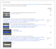
From your screenshot, PSI is flagging “Unsized image element” and the HTML shown is the giveaway:

  • Your images have width/height attributes
  • …but the initial src is a tiny inline SVG placeholder (e.g. src="data:image/svg+xml,...")
  • The real image is only applied later via data-lazy-src / data-lazy-srcset

That pattern often still causes CLS because the browser lays out the placeholder, then swaps in the real image and recalculates layout (especially inside flex containers / Elementor containers).

Also, replacing padding with a spacer rarely fixes CLS if the shift is coming from images, fonts, sticky headers, or late-injected widgets.

Before changes: take a full backup (files + DB) or at least create a restore point in your host.

Step 1 — Identify which lazy-load is doing this

Elementor has its own “lazy load background images”, WordPress has native lazy-loading, and many performance plugins (WP Rocket, LiteSpeed Cache, Autoptimize, SG Optimizer, Perfmatters, etc.) rewrite images to placeholders.

Check:
  • Elementor → Settings → Experiments (and Features) for anything related to optimized image loading / lazy load
  • Your performance plugin settings for LazyLoad images and LazyLoad CSS background images
  • View source and confirm if images are being rewritten to src="data:image/svg+xml..." with data-lazy-src=...

If a plugin is doing the rewrite, fix it there (best option).

Step 2 — Exclude “above the fold” images from lazy-load

The biggest CLS wins usually come from excluding:
  • Hero image(s)
  • Logos in the header
  • Any image visible without scrolling (especially in the section PSI highlights)

How you do this depends on the plugin, but most have:
  • “Exclude images from lazyload by CSS selector”
  • “Exclude by class”
  • “Exclude first X images”

Good selectors to try (adjust to match your hero section):
Code:
.e-con-inner img
.elementor-top-section img
header img

If you can target only the hero image widget, even better:
  • Edit the image widget → Advanced → CSS Classes → add: no-lazy
  • Then exclude .no-lazy in your lazyload plugin settings

Step 3 — Force a stable aspect ratio (CSS),not just attributes

Even with width/height attributes, CSS can override sizing in a way that still shifts (common with flexbox containers and responsive images).

Add this in Appearance → Customize → Additional CSS (or your child theme stylesheet). Test carefully:

Code:
/[I] Reserve space for Elementor images to reduce CLS [/I]/
.elementor img {
  height: auto;
}
/[I] If you have images that are styled to a fixed height, enforce aspect-ratio [/I]/
.elementor img[width][height] {
  aspect-ratio: attr(width) / attr(height);
}

Note: attr() for aspect-ratio support is not consistent across browsers. If it doesn’t help, set aspect ratio via a class on the specific widget:

  • Edit the problem image widget → Advanced → CSS Classes: hero-img

Then:

Code:
/[I] Example: 450x450 [/I]/
.hero-img img {
  aspect-ratio: 1 / 1;
  width: 100%;
  height: auto;
}

If it’s not square, use the real ratio (e.g. 16 / 9, 3 / 2, etc.).

Step 4 — Fix “blue section below the form” shifts

If that section shifts after load, common causes in Elementor are:
  • Webfont swap (FOIT/FOUT) changing line heights
  • Form validation messages appearing and pushing content
  • Sticky header height changing after JS runs
  • Animations/motion effects triggering layout changes

Quick checks:
  • Disable Elementor animations/motion effects on that section
  • If it’s a form: reserve space for error messages (CSS min-height on message containers)
  • If fonts: ensure “font-display: swap” is set (many optimization plugins can do this)

Step 5 — If you want the cleanest fix: stop placeholder swapping

If your lazyload plugin supports “native lazyload” (browser) instead of rewriting src, use that mode. You want HTML like:

Code:
<img src="real-image.jpg" loading="lazy" width="..." height="...">

Not:
Code:
<img src="data:image/svg+xml..." data-lazy-src="real-image.jpg">

That rewrite is a frequent CLS trigger.

If you share the URL, I can point to the exact element

If you can post the page URL (or the section HTML),I’ll tell you:
  • Which lazyload system is rewriting the images
  • Which exact selector to exclude
  • Whether the shift is images vs fonts vs header/form behavior
 
T

toad78

New Member
There are no images above the fold lazyloading. You can see this in the code itself.

There are no animations above the fold.

Because of the forums restrictions, I cannot post a URL.
 
Elementor Services Elementor Services

Latest Resources

Other Elementor Resources

elementor official
Top