• Join the Best Wordpress and Elementor Support forum

    Provide or get advice on everything Elementor and Wordpress, ask questions, gain confirmation or just become apart of a friendly, like minded community who love Wordpress and Elementor


    Join us!

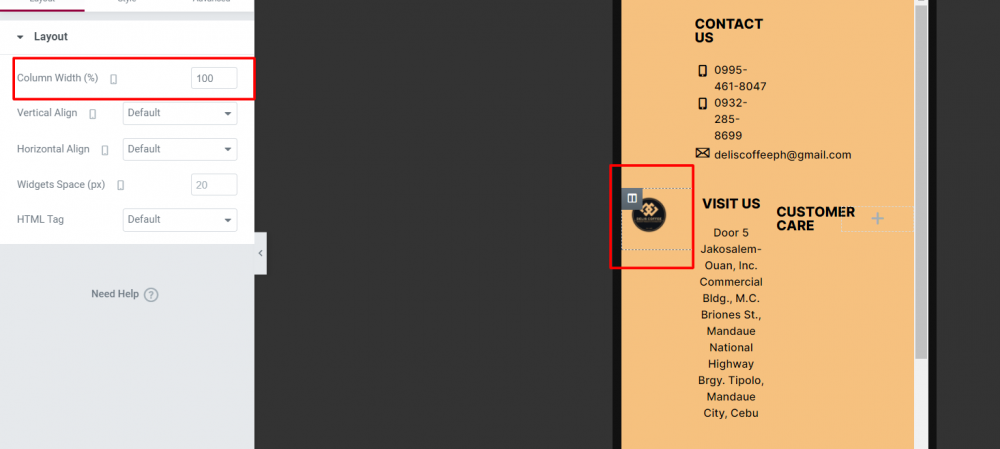
Columns width 100% not working in mobile

B

benzomai

New Member
I am using Phlox theme and Im trying to stack my 2 columns in mobile view into rows but a 100% column width in mobile view is not working. This is not the first time using Phlox theme, I have 1 website also using phlox theme but there is no such problem as this one.
1613550012030.png
 
C

chahra

New Member
Hello, did you resolve your problem? I have the same issue and I couldn't fix it .. Thanks
 
Last edited:
N

NOWCFO

New Member
Same problem here. Using Phlox theme. Anyone found a fix?
 
N

noahzollinger

New Member
Hi there
I also faced this problem today. I fixed it with the following custom CSS:

CSS:
@media screen and (max-width: 1023px) {
.elementor-section .elementor-container {
    flex-flow: wrap;
}
}

Add this code inside your Customizer -> Custom CSS. It will fix it.
 
Miche11e

Miche11e

New Member
Hi there
I also faced this problem today. I fixed it with the following custom CSS:

CSS:
@media screen and (max-width: 1023px) {
.elementor-section .elementor-container {
    flex-flow: wrap;
}
}

Add this code inside your Customizer -> Custom CSS. It will fix it.
Thank you for sharing this! I only use Phlox, so I was dreading having to switch themes. I tried your solution and it worked!
 

Latest Resources

Other Elementor Resources

elementor official

Still stuck? Ask the forum

Post your question with a screenshot and a link if you can, and a member will usually reply within a day. Free to join, no sales pitch.

Create a free account
Top